Introduction
Integration Engineer & Product Designer
Come join me in creating products that truly matter! I bring a unique blend of technical expertise and creative design thinking to create meaningful user experiences that make products eaiser to use.
About Me
My Story
👋 Hey there! I'm thrilled to share a little glimpse into "my story" and the exciting journey that led me to the world of UX & Product Design.
With a degree in computer science and engineering under my belt, I've been fortunate to work in the role of an Integration Engineer and Technical Consultant, a path I truly adore. Yet, alongside my professional journey, an irresistible interest in UX & Product Design has been quietly burning within me. It's like this hidden excitement about how people and tech come together to create cool experiences.
My interest in UX & Product Design all started during an important moment in my academic journey – my capstone project for Software Engineering class. As part of our capstone project, my friends, who were also classmates, and I built an iOS app for college students to find rides when traveling back home during break. As the design enthusiast in the team, I worked on designing the logo and making the UI look all nice. It was truly a joy! The app gained a lot of praise for its idea, design, and functionality, leading us to win first place in the CITRIX Mobile App Challenge! This victory fueled my pursuit of Product Design, a passion that ties perfectly with my tech background.
When I’m not geeking over tech, you'll find me traveling to national parks and capturing epic views with my drone. Oh, and did I mention that I'm a huge NBA enthusiast? Can you guess my favorite team? If you're as passionate about technology and design as I am, or if you just want to chat about hoops, feel free to connect. Let's embark on this exciting journey together!
| Name | Vraj Parikh |
|---|---|
| Location | Orange County, California |
| vraj.s.parikh@gmail.com | |
| vrajsparikh |
-
UKG
( 2023 — Present )Lead Integration Engineer
Team Lead for UKG's HR Service Delivery Integrations Delivery team. Deliver end-to-end technical solutions for UKG Document Manager and People Assist products, ensuring seamless user experiences and client satisfaction.
Skills and Tools Utilized: Python · SQL · Single Sign On (SSO) · SFTP · RPA · Linux Shell · JIRA · Confluence
-
UKG
( 2016 — 2022 )Sr. Integration Technical Consultant
Utilized development and consulting skills to build and test custom data integration solutions for UKG Pro customers. Developed, test, and analyzed custom electronic data interchange (EDI) interfaces using SQL stored procedures and in-house tools to extract demographic, benefit, and financial data in UKG Pro and send to client's vendors.
Skills and Tools Utilized: SQL · Consulting · Electronic Data Interchange (EDI) · NetSuite · Salesforce
-
University of California, San Diego
( 2020 — 2023 )User Expierence Design Certificate
The User Experience Design certificate provides students with practical knowledge of UX principles, software, and techniques for analysis. Courses taken are post-baccalaureate, professional-level courses designed to provide opportunities for professional advancement and enable the general public to gain knowledge in various academic fields.
Relevant coursework: Principles of UX · User Experience Design I · User Experience Design II · Responsive Design and User Expierence (UX) · UX Portfolio
-
University of California, Merced
( 2012 — 2016 )Bachelors in Computer Science & Engineering
Computer Science and Engineering students at UC Merced work with the world's top computer scientists and engineers. This discipline constitutes one of the strongest industrial sectors in the state and the nation, offering a program of study that combines practical exposure to the most modern technologies available with a theoretical foundation that empowers students to master future changes and innovations as technologies continue to evolve at an astonishing pace.
Relevant coursework: Software Engineering · Object Oriented Programing · Database Systems · Algorithms Design and Analysis · Computer Graphics · Spatial Analysis and Modeling · Intro to Computing Theory · I.T. Strategy

case study
Shaadi.com Case Study
case study
A UX Case Study on Shaadi.com

Background
Shaadi.com stands as a prominent and widely recognized online Indian matrimonial platform on a global scale. Since its inception in 1996, the company has maintained its position at the forefront of the matrimony category, boasting a vast user base of over 35 million individuals worldwide. With a core focus on facilitating meaningful connections for marriage, Shaadi.com remains committed to its mission. Through its website and mobile application, the platform continues to play a pivotal role in uniting millions of people in their journey to find their ideal life partners.
"In India, marriage is between two familes rather than individuals."
What is Shaadi?
Before we get into the case study, let's understand what Shaadi is and the culture behind it. Shaadi is a generic term for wedding in the South Asian Culture. In South Asia countries, marriage is between two families rather than individuals. Arrange marriages are a common thing in India and it is a tradition Indians find hard to part with. Even in the 21st Century, around 75 percent young Indians (18-35 years old) prefer to marry the person chosen by their families according to a 2013 IPSOS survey.
Goal
This case study aims to analyze the matrimonial app, Shaadi.com, through the lens of user experience. The primary objective is to uncover potential pain points that users might encounter during their interaction with the app. By conducting comprehensive user research, the intention is to not only pinpoint these challenges but also to understand reasons for the pain points. Furthermore, this study aspires to present viable solutions to address these identified issues.
While Shaadi.com is predominantly recognized for its web presence, this investigation will focus exclusively on its mobile application. The usage with mobile devices has significantly increased over the last decade and most people favor using mobile applications over websites to performtasks or browse.
Target Audience
Given the integral role parents play in the partner selection process within Indian culture, the Shaadi.com platform serves as a pivotal avenue for both parents and their prospective sons or daughters-in-law. Therefore, the focal point of this case study revolves around the following key audience:
- Singles between the ages of 22 - 35
- Parents of Singles between the ages of 22 - 35

The current UI...

Usability Testing and Findings
I engaged in a comprehensive research process involving both user testing and thoughtful analysis to gain deeper insights into the app's holistic user experience. This research was conducted with a diverse group, including two parents and three individuals actively using the app. I tested scenarios where participants undertook pivotal actions like profile creation, configuring partner preferences, utilizing the search function, and establishing connections with matched profiles. This methodology offered a multifaceted view of how users engage with the app.
Furthermore, to get a better understanding, I read through reviews within the Apple App Store and Google Play Store. This enabled me to pinpoint user experience challenges they were encountering.
Throughout the research, I found the following issues:
Complex Information Architechure:
The app's information architecture emerged as notably intricate, potentially confusing users and hampering their navigation.
Viewing Profiles is not User Friendly:
A prevailing challenge was the user-unfriendliness tied to viewing profiles. This friction might hinder users from engaging effectively with potential matches.
Difficult to Find and See All Personal Matches:
Finding and knowing all personal matches proved to be a stumbling block, indicating room for enhancement in user-friendly features and intuitive design elements.
Problems and Solutions
Problem 1: Complex Information Architecture
Information Architecture is all about how the information is organized in the app. The app currently has 4 pages (My Shaadi, Matches, Inbox and Chat). Each page consists of a lot of information and some pages even have overlap of features. For example, both Shaadi and Matches display a list of potential match profiles.

There are lot of features Shaadi.com offers. However, these features overlap, as mentioned above, or they are hidden. It takes multiple actions to get to certain key features. For example, Options & Settings is hidden on the bottom of the My Shaadi page. Users have no idea it is there unless they scroll down. The app also provides many different categories which ends up hurting the user experience rather than helping. These categories include - New, Today’s Matches, My Matches, and more.

Why is this a problem?
The information architecture plays an important role on the overall user experience of the mobile application. The reason why many people use apps over desktop websites is to quickly view or perform an action. In the case, Shaadi.com users want to quickly be able to view profiles, new matches, and more importantly be able to chat with matches. It is important that the app provides a simple, easy to use experience for all age groups. When I asked parents to go to settings and update the preferences, they had a hard time finding where the setting and options were. Most are used to seeing the person or gear icon to update settings. Some made it to the My Shaadi page, but when they scrolled, they just saw a list of more profiles and went to the next page. Lots of different categories. Have to scroll left and right to see more. Options & Settings are located near the bottom of the My Shaadi tab. Not visible unless user scrolls down. They didn’t know it was all the way at the bottom. Having profiles on multiple pages is confusing to the user and gives them a hard time determining where to look.
Solution
An effective information architecture whose structure is based on the understanding of users keeps the users happy and more likely to continue using the application. As straightforward as it sounds, the solution here is to redesign the UI to be more simple ensuring categories and subcategories of information are distinct and user friendly. Why complicate it?
There was an overlap and plethora of information in each tab which made it difficult and overwhelming to navigate around. In order to get a better idea on how to organize all the information, I utilize the card short technique . Each card (or in this case post-its) contained essential features of the app. I worked with users and test participants to group cards by similar functions. Ultimately we came to the conclusion of these five categories:
Suggested - Suggest few matches every day based on user's partner settings.
Explore - View all otoher potential match profiles. Users also have the ability to filter and search for profiles.
Likes - View likes received, likes given, and shortlisted profiles.
Matches - This is where users will be able to view all their matches, chat, and/or video call.
User Profile - Update profile, parter preferences, contact filters, and other settings.

Using the card sort technique to help design the information architecture
Going into this, I was set on having only four categories. From doing this study, I learned that it would be best to separate suggested and explore screens. The suggested page provides a familiar functionality to most modern dating app's swipe feature that the younger generation is accustomed to. Parents like being able to view multiple profiles at once. Separating the suggested and explore categories provides a simple navigation for both single adults and their parents with just one tap once logged in.
Problem 2: Viewing Profiles is Not User Friendly
The current user interface is misleading when users try to view more pictures, review bio information, and perform actions when viewing a profile. The arrows on the profile picture can indicate to users that it will show the next picture, but instead it shows the next profile. During my user testing, 2/3 users swiped to view the next picture. They were surprised as it redirected to the next profile instead of the next picture. There was no indication that users have the click on the picture to view more pictures.

There is only one action that comes up with viewing someone’s profile. Connect now. Shaadi.com has a great feature where it allows users to shortlist potential matches. This is useful when parents are using the app and want to save the profiles they like. Their son or daughter can go in at a later time and view the potential matches their parents have selected. This feature is hidden under the more options icon.

Why is this a problem?
Users want to view profiles at ease. Having trouble viewing pictures or digging through the page to find key information can frustrate and overwhelm users. This could lead to users deleting the app.
Solution
My goal here was to keep the profile information clear and make it easy for the user to take action. If they need to take an action, for example - Like, Skip, or Shortlist a profile, it needs to accessible and obvious. When I interviewed current users of the app, I learned that the profile pictures and key bio information were the first things that drew their attention when reviewing a profile. I decided to keep the profile picture at the top of the page but also added in a feature where it allows users to swipe right to view more pictures without tapping on the picture. This allows users to see key bio information and view multiple pictures at the same time. And most importantly it relives frustration users had when they accidentally found themselves moving to the next profile. I also moved the action button connect now, along with two new ones - skip and shortlist to the bottom of the page. By doing this, it places the action buttons in natural places where the users thumb or finger is most likely to be.
Wireframe of the solution:

Problem 3: Difficult to Find and View All Personal Matches
Another problem I discovered during self analysis and user testing was that the users had a hard time locating the exact page or tab where all matches can be seen.
The app currently has a section that shows Premium Matches and New Matches on the My Shaadi screen. It also shows “my matches” on the Matches screen, “Accepted” on the Inbox screen, and “my matches” on the Chat screen.
"But which one of these actually show the profiles I got matched with?"
The actual matches seem to be located on the chat page. It is difficult to view all of them because users have to scroll horizontally. All we can see are small icons of each match.

Why is this a problem?
Users should not have to go exploring to find the feature they want to access. During user testing, participants were confused where the matched profiles were located. Quite frankly, I also had a hard time finding the location of matched profiles. Most of them went to the Matches page first, but couldn’t find it there. Eventually after going to each page most were able to find it in the inbox and chat page. Not only was this frustrating to the participants, but also time consuming. This leaves an unpleasant first impression of using the matrimonial app.
Solution
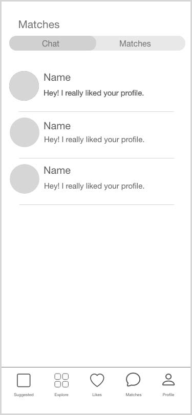
Since there was no clear direction where the matches were, I decided to rename the chat tab/page as “Matches” while keeping the chat icon. This gives familiarity to the young generation who are accustom to using other dating apps and also gives a clear indication to parents where the matches are. On this page, users are able to see all matches in a grid view rather ran just seeing their face icon. One of the issues with chat was that it felt system generated because it would atomically send a default message when one got matched. This can easily be updated to only contain matches that one has started the conversation with.

Conclusion
Shaadi.com is one of the most widely known South Asian matrimonial platforms across the globe. When I first used the shaadi.com mobile app, I felt like there was a serious need for a redesign. It was overwhelming to use and felt outdated compared to some of their competitors. It only lasted two days on my phone before being deleted. I went into this case study with the goal of finding issues and solutions that were beneficial to not only young single adults, but also their parents as they play an important role in finding their son/daughter’s spouse in the South Asian culture. The shaadi.com mobile app currently has a complex information architecture, viewing profiles is not user friendly, and it is hard to locate matched profiles. Solving these usability issues can keep the matrimonial app popular and in the trend with all the new dating apps in the market.
Check out how solutions to these challenges came to life in my Shaadi App Redesign next


mobile, design
Shaadi.com Redesign
mobile redesign
The Redesign of Shaadi.com Mobile App

Background
Shaadi.com is one of the biggest and well known online Indian matrimonial sites across the globe. The company launched in 1996 and still continues to lead the matrimony category with over 35 million people all over the world. Shaadi.com is aimed towards finding someone to marry and currently helps millions of people find matches through their website and the mobile application.
The Challenge
To create a better user experience through the redesign of the Shaadi mobile application while solving issues identified in the case study.
In the Case Study we identified the following
problems:
- Complex information architecture
- Viewing profiles is not user friendly
- Difficult to find and see all personal matches
Wireframe
Low Fidelity Wireframe:
I started off the design process by creating a low-fidelity
wireframe on paper. The low-fidelity wireframe allowed me to quickly
draw up design ideas without overly disrupting the design process. I
explored different designs for the same page to determine which
design would bring a better overall experience to the user.


High Fidelity Wireframe:
Once I had a good overall design idea, I moved on to creating a high
fidelity wireframe by adding more detail to the pages. This gave an
idea of how the information architecture is going to be organized
and also got a better idea of how the final design elements are
going to look like.




Prototype
Once the information architecture was finalized in the high fidelity prototype, I added interactivity and color to stimulate and test the design. During this step, it is important to focus on the usability of the application and not get distracted by the look and feel. Therefore, I only added design elements that helped with the usability. I used my phone to conduct user testing on the prototype. As a bonus, this also helped me make sure the buttons and font were the right size and placed correctly on the screen. In this process, I discovered that the skip, like and shortlist buttons were too close to each other which could lead the user to accidentally selecting the wrong action.
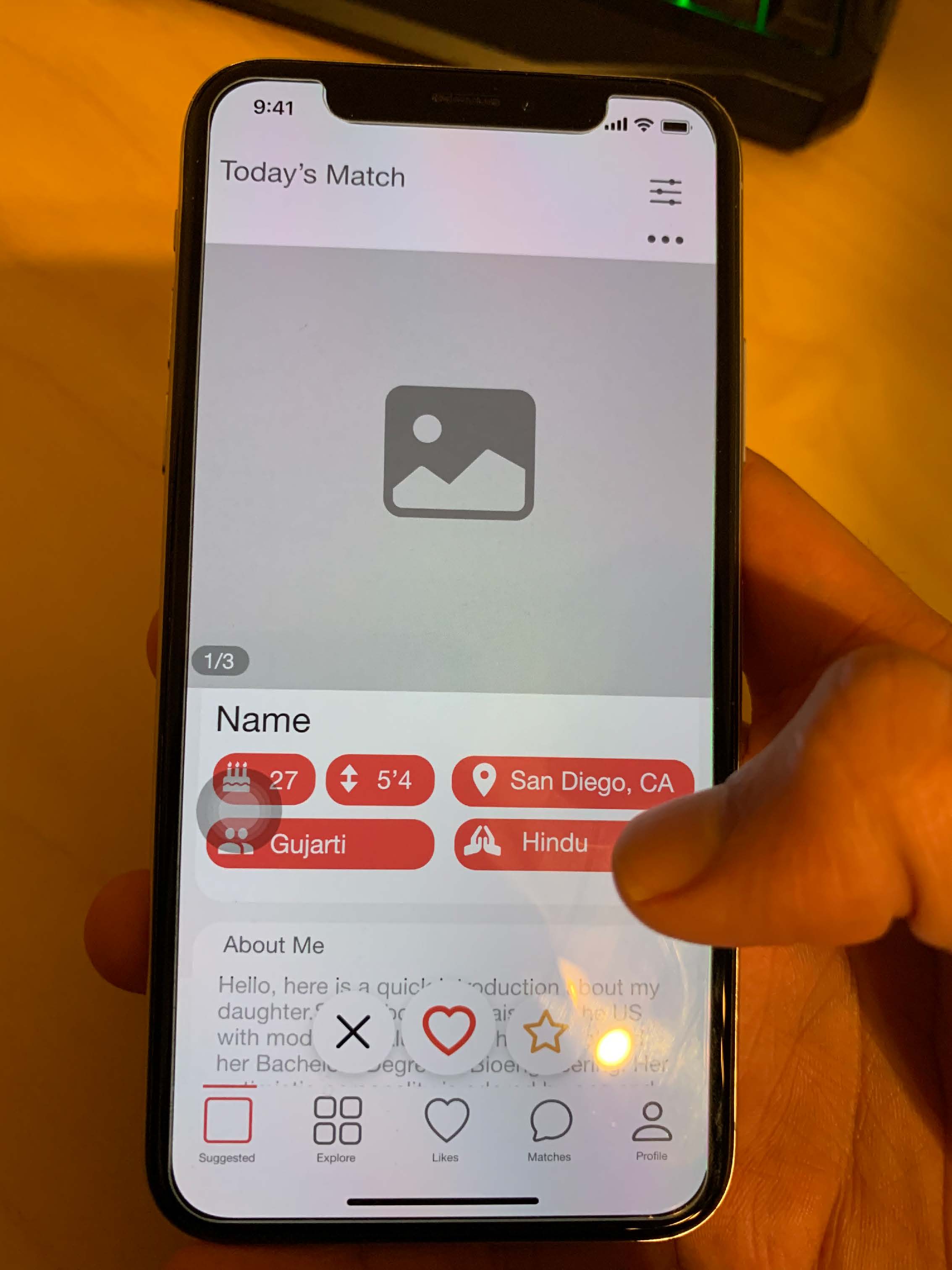
Testing the protoype on iPhone XS

Added interactivity to high fidelity wireframe to create a prototype using Adobe XD.
The Final Design

During the case study, we identified that one of the main issues with the current design was that the information was everywhere. There was lots of information on one page with overlap of information on multiple pages, action buttons were misleading, and hard to find certain items. To solve this, I started from the ground up and reorganized the information architecture using the card sort method mentioned in the case study. I wanted to provide a simple and clean experience for the user, therefore I grouped similar functions into these five categories - Suggested, Explore, Likes, Matches, and Profile.
User Interface
For the final UI, I decided to keep shaadi.com's brand colors the same as it has become a recognizable matrimony platform for over 20 years. UI is kept minimal by using only three colors.
Primary
#FF5A60
RGB(255, 90, 96)
Secondary
#7C7C7C
RGB(124, 124, 124)
Alternative
#01BCD6
RGB(1, 188, 214)
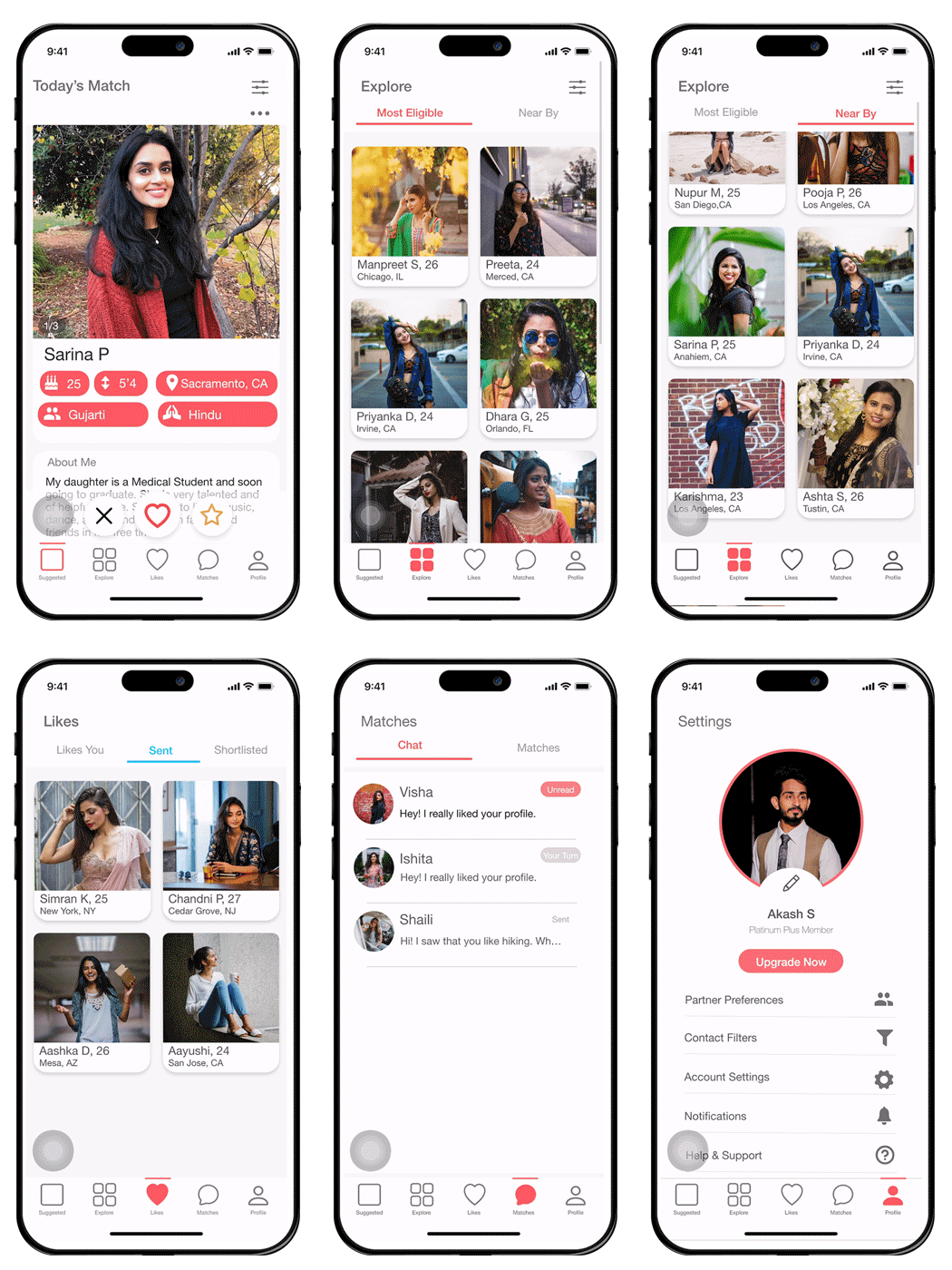
Preview of final design

e-commerce, web, design
Specly
e-commerce, web, design
Specly E-Commerce Design

In this project, I embarked on a comprehensive exploration of e-commerce design, encompassing the creation of a brand logo, a style guide, an immersive UX prototype, and the strategic implementation of a usability testing plan. It's important to clarify that Specly is not a real compamy , and this initiative was a pivotal component of my journey within the UX Design Certificate program at UC San Diego.
Background
Specly is an online retailer of prescription glasses and sunglasses based in Los Angeles, California. Specly manufactures its glasses in-house instead of paying external manufacturers and passes on the savings to its customers. Specly’s main slogan is “Trendy glasses that make you feel good while leaving money in your pocket.” Specly’s purpose is that prescription eyeglasses should be affordable for everyone. People should not need vision insurance to afford designer-quality eyewear. Eyeglasses not only help you see, but they are also a fashion statement. Most importantly, glasses should be easy and exciting to pick out and order. Specly offers trendy, fashionable eyewear that can go on adventures with you while keeping money in your pocket.
Objective
The objective of this project is to create an online retail website to sell Specly’s products. Since Specly is a completely online retailer, the website will be the primary location for selling the products and for customers to discover the Specly brand. The goal is to optimize the end-to-end shopping experience.
Target Audience
- Millennials (Ages 25 – 34)
- People who may not have great vision benefits.
Design Process
Step 1: Logo Design
- Create a logo that represents the brands values.
Step 2: Style Guide
- Color Palette
- Typography
Step 3: Wireframe
- Initial wireframe of the website.
Step 4: Interface Design
- Visual design for Home, category, product.cart,checkout pages.
Step 5: Initial Prototype
- Interactive prototype with checkout process.
Step 6: Usability Test and Evaluation
- Utilize the DECIDE framework to develop a usability test.
- Evaluation of the website and gather feedback from partcipants.
Color Strategy
When selecting colors, it was important to choose colors that represented what the brand stands for - fun, affordability, and reliability. I decided to go with yellow as the brand’s primary color as it represents adventure, happiness, fun, and affordability. The second color blue represents trustworthiness that Specly's customers can rely on their products. Midnight Gray is a color that complements both yellow and blue and gives the company a modern outlook.
Spectacular Yellow
#FFCE2D
R255 G206 B45
Ocean Sky
#587AAD
R88 G122 B173
Midnight Gray
#525F6D
R82 G95 B109
Logo Design
Master Logo

Specly’s master logo contains round shape glasses with Specly written in the Montserrat font.
Logo Variations
Secondary logo/ Logo mark only

Logo on dark background, use white logo

Horizontal Layout
Typography
Montserrat and Roboto fonts are two extremely popular fonts that pair well together and provide a modern and aesthetic look. Montserrat is the brand's primary typeface and will be used for the logo text, headers, titles, and short item descriptions. Roboto is the brand's secondary typeface and will be used for long body text, annotations and accents.
Primary Typeface
"The quick onyx goblin jumps over the lazy dwarf"
"The quick onyx goblin jumps over the lazy dwarf"
"The quick onyx goblin jumps over the lazy dwarf"
Secondary Typeface
"The quick onyx goblin jumps over the lazy dwarf"
"The quick onyx goblin jumps over the lazy dwarf"
"The quick onyx goblin jumps over the lazy dwarf"
"The quick onyx goblin jumps over the lazy dwarf"
Wireframe
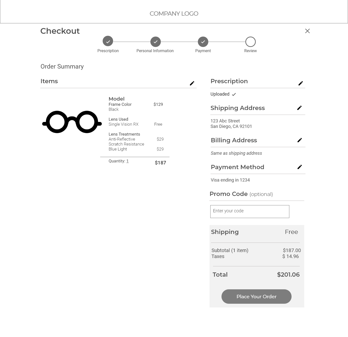
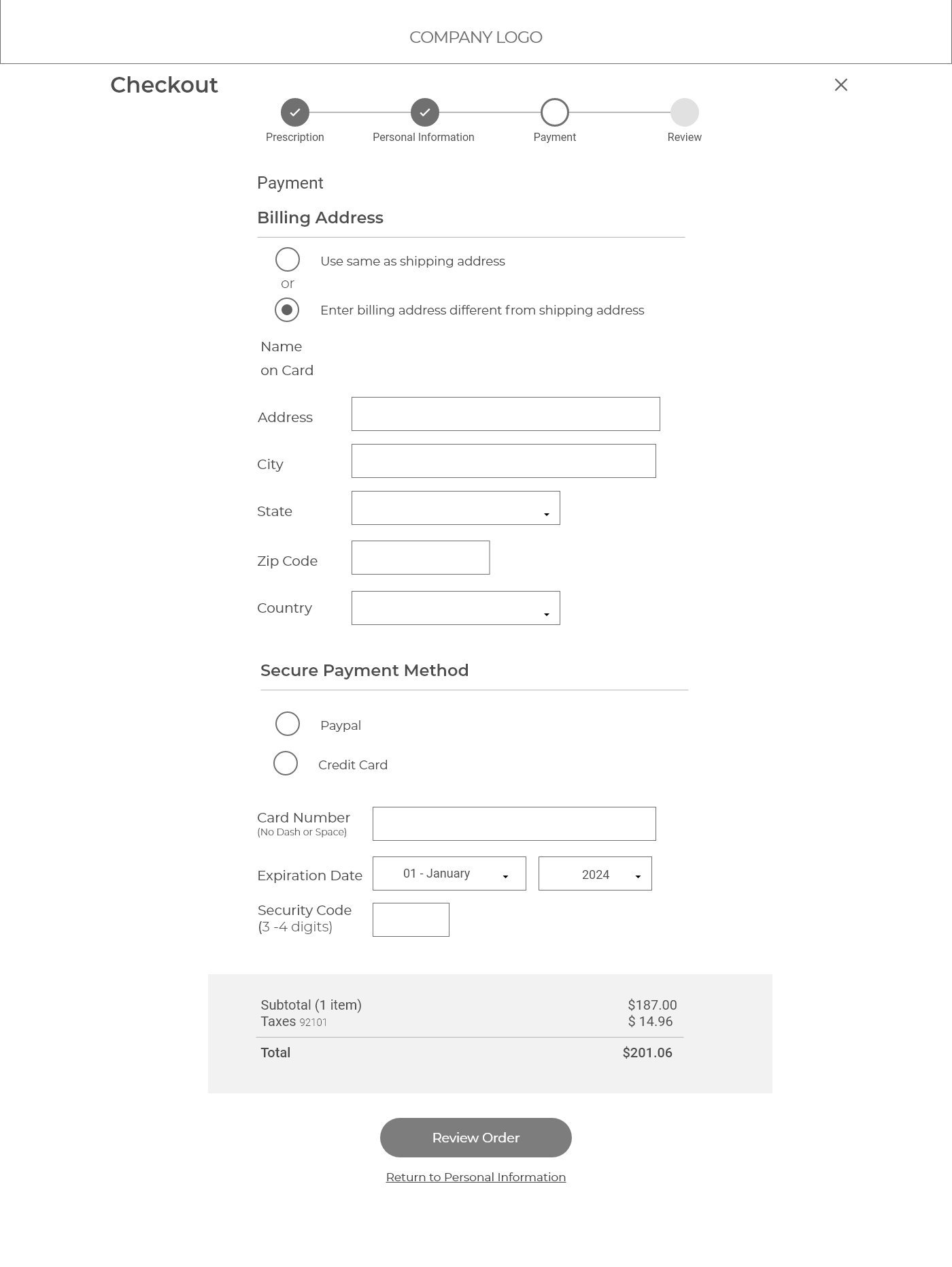
For selling eyewear, my primary target will be a web interface with a mobile interface also in consideration. The web interface will allow users to navigate freely and view more products easily. I started off creating a wireframe, which allows us to focus on the grid and flow of content, and not get distracted by imagery and color. It also provides a way to explore different design ideas and present them to the client. Within the Specly website design, I put more emphasis on the checkout process as it is an important feature for an e-commerce website.
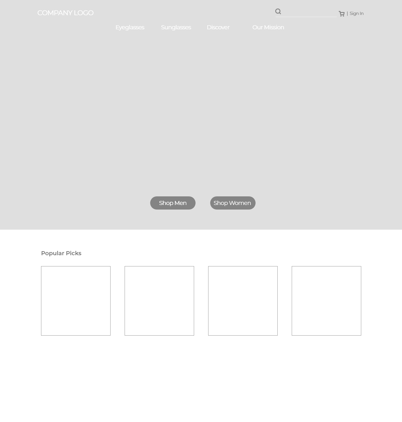
Home Page
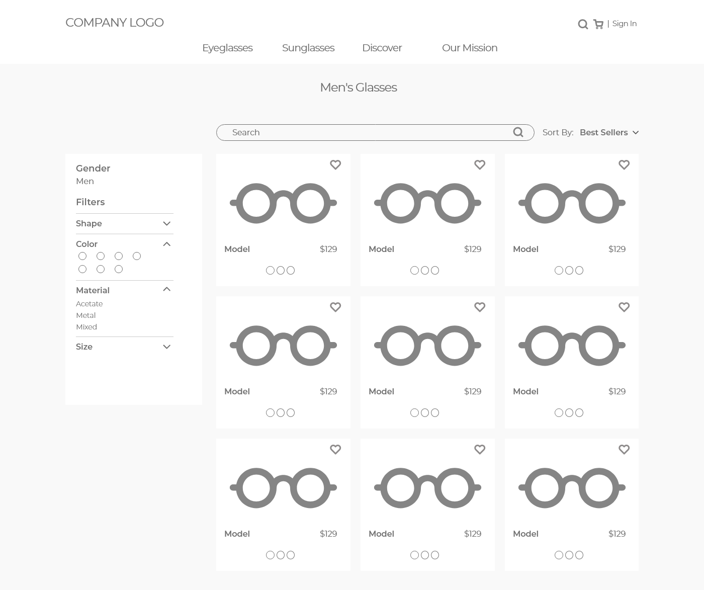
Product Listings
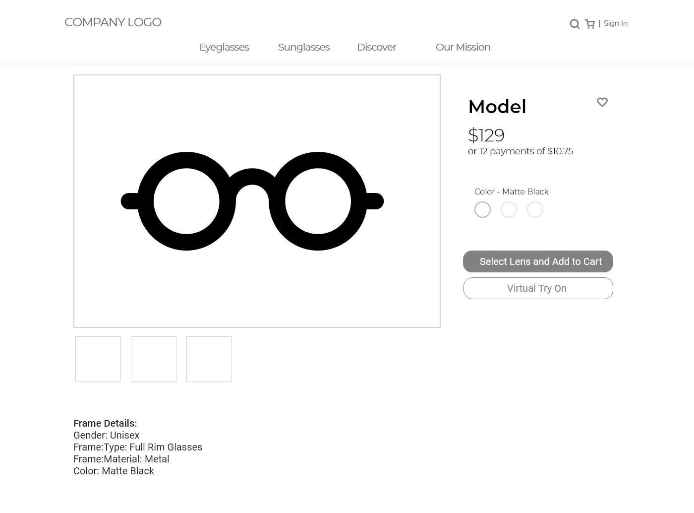
Product Page
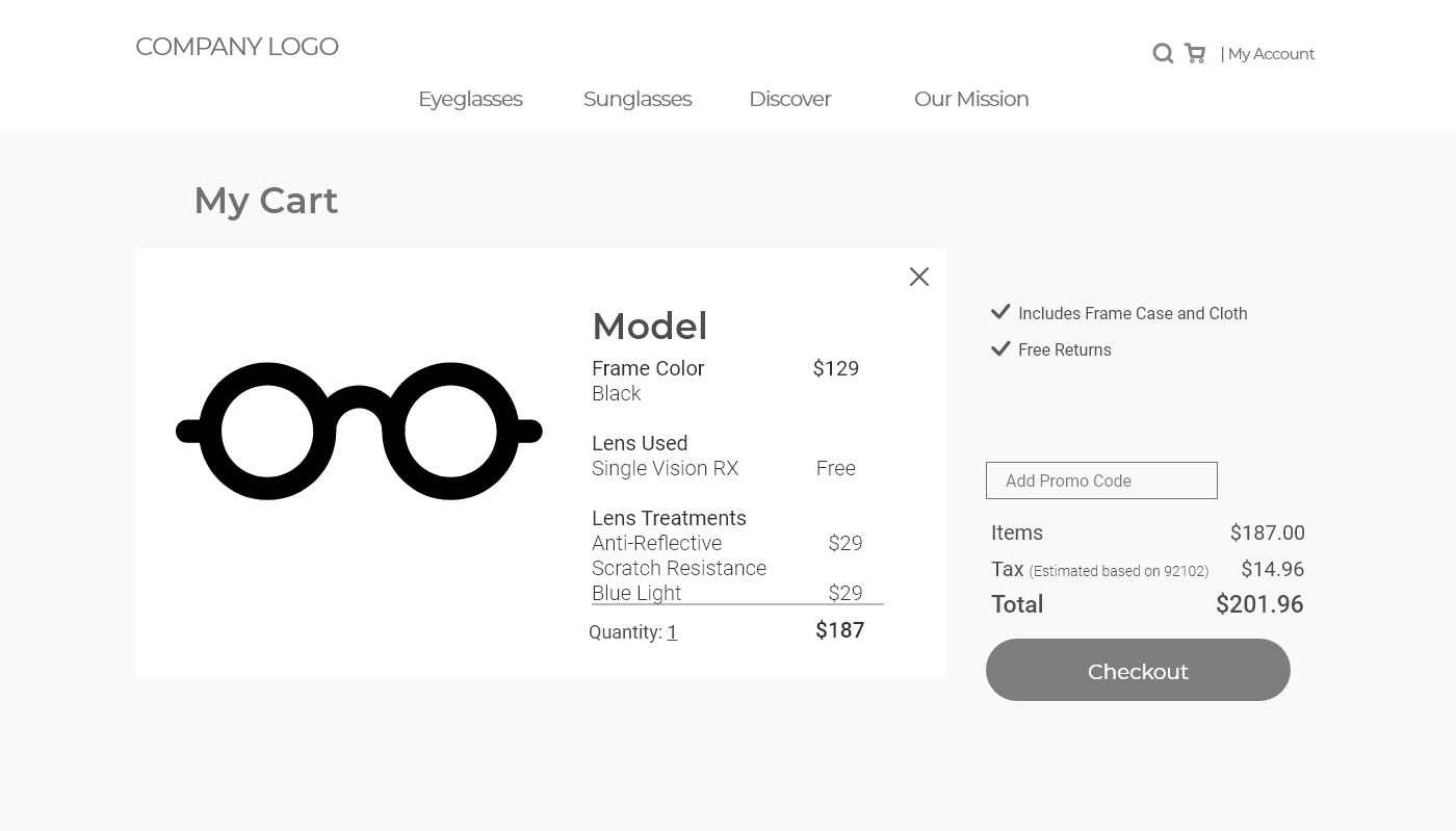
View Cart
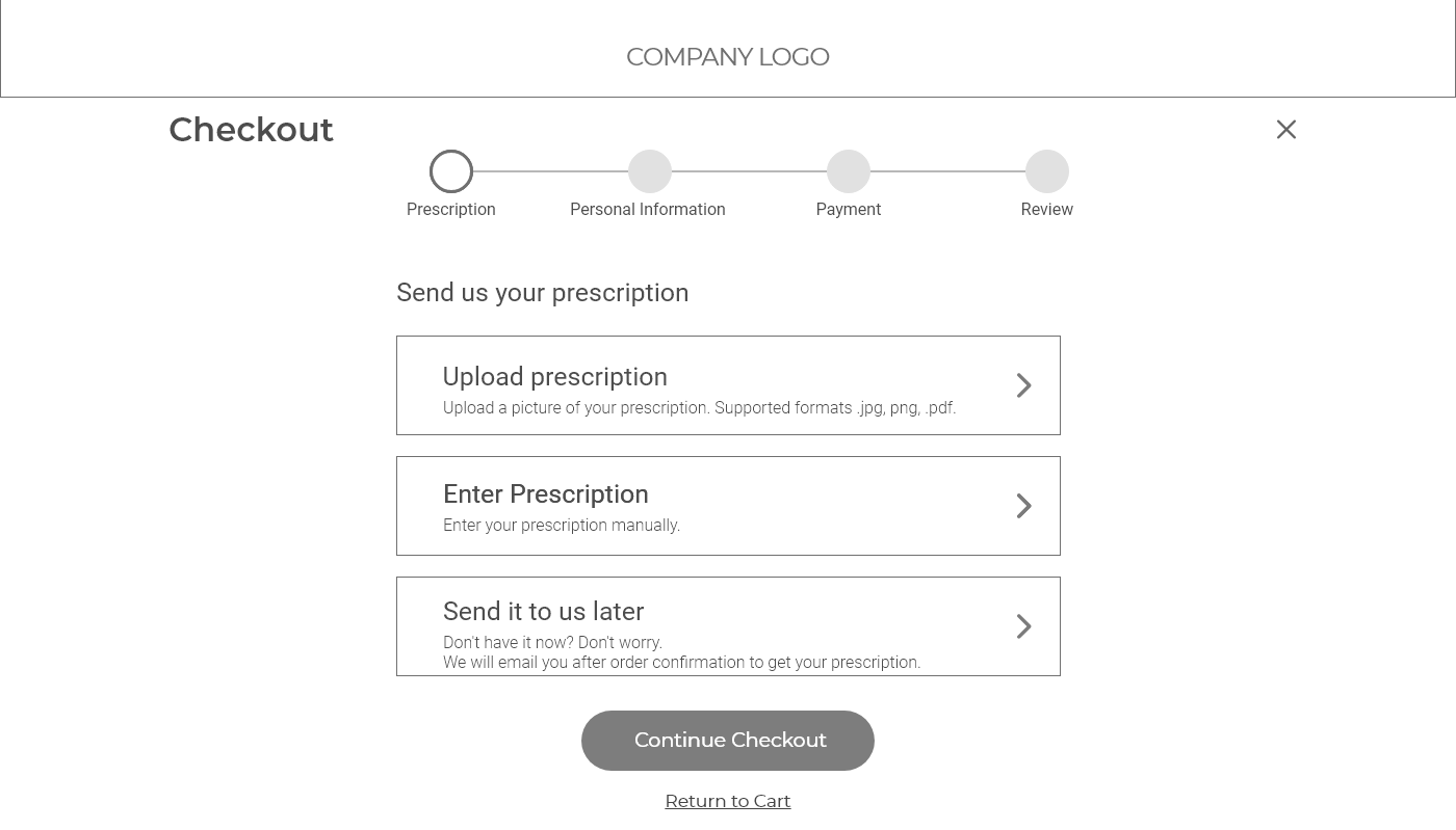
Checkout Step 1 – Prescription
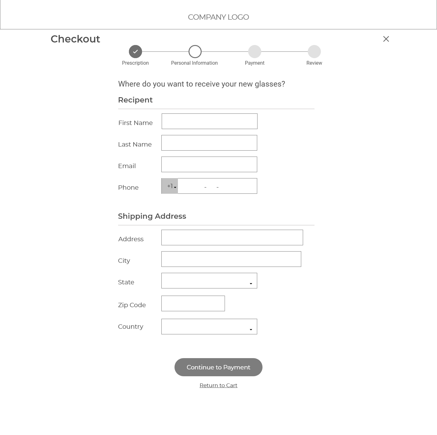
Checkout 2 - Personal Information
Checkout Step 3 – Billing Information
Checkout Step 4 (Final Step) – Review and Place Order
Interface Design
Once I had the visual representation of the Ul layout and the information architecture in place from the wireframe, I started to apply the brand colors and imagery to make the design come alive.
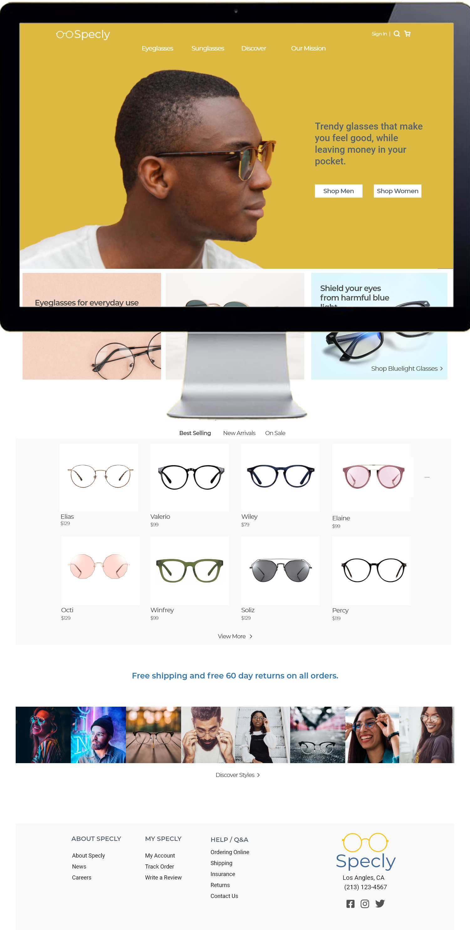


Interface Protoype
Can't complete the design without a prototype. The prototype brought the interface design to life with all sorts of interactive goodness. It's like a sneak peek of what Specly's website could be. It allowed us to explore and experiment with ideas as well as check functionality and usability tests.

Flow of Specky's website
View Interactive PrototypeKey Takeaways
This project consisted of creating the branding and an e-commerce store from the ground up for an online retailer of prescription glasses and sunglasses. The user experience was just as important as the user interface for this project. Working on this project, I had to consider multitude of aspects: operational simplicity, strong branding, effective use of visual elements, easily available general and contact information, users’ ability to leave feedback on products, and overall a good end to end shopping experience. A good user experience is crucial to e-commerce website as it helps with user retention which is the direct condition to growing profits. I hope that this design provides a simple and pleasant shopping experience to customers and leads to increase sales for Specly. Final Design

research, usability testing
Specly Usability Test Plan
research, usability testing
Specly Usability Test Plan

The purpose of this usability study is to improve the overall user experience of Specly’s website and online store by conducting user experience testing with a sample of potential customers. I used the DECIDE framework for this study as it provides a well-planned evaluation driven by goals that aim to seek answers to questions.
Determining the high-level goals of the evaluation
- Determine if customers are satisfied with the overall user experience of the website from navigating the website to purchasing an item.
- Understand how often customers are viewing a product from the home screen vs. searching for a product in a category.
Exploring the Questions
Once the goals were in placed, I explored the questions that will get us the answers we are looking for. Started off with background questions to get a general idea of the demographics:- In the past year, how many times have you bought new glasses?
- Within the next 6 months, do you plan on getting new glasses?
- Do you wear prescription glasses?
- Have you ordered glass online before?
- What is your age?
- Does this website provide me with all the information I need to make a purchase?
- Rank the convince of the checkout process.
- I found the navigation of the website to be ... (rank from 1 to 5)
- Were you easily able to search find the items you were looking for?
- Does the try on feature help me when making a purchase?
- Do you like seeing the actual project in its natural setting rather than stock images?
- Do you prefer viewing similar styles together or having a combination of all products such as both clear glasses and sunglasses on the same page?
- What features do you find most valuable and why?
- What is important to you when ordering new glasses?
- What do you like the most/the least about our website?
Evaluation Approach and Methods
The next step was to come with different evaluation methods to ask our questions. I narrowed it down to these approaches:-
In-Person Testing
- Have participants complete tasks such as purchasing a pair of glasses.
- Use Think-Aloud technique to understand the user’s thought process as they are navigating through the site.
- Monitor first click to make sure users go down the right path.
- Satisfaction/Feedback survey at the end of the test.
-
Remote Testing
- Have participants explore the website followed by a survey at the end.
-
Observation
- Track how many times participants view products from the home page vs. going to categories.
-
Satisfaction Survey
- Conduct survey after the participant is done exploring the site.
Identify Practical Issues
- Some users may have never ordered glasses online so this may be a completely new experience.
- Survey only participants that have not seen this website before to eliminate biased results.
- Not all participants will be in person.
- Since this is just a prototype, not all pages are fully functioning.
- Hard to do in-person testing for all participants.
Decide How to Deal with The Ethical Issues
- Explain the purpose and goal of the study before starting the test.
- Inform participants how their data and feedback will be collected.
- Have participants sign a consent form.
- Specly Consent Form
Evaluate, analyze, interpret and present the data
The test included 5 participants including 4 in-person tests and 1 remote test.
The in-person test participants were given a task to do while I observed their actions.
4/5 participants went straight to shop men / shop women action items without scrolling down on the home page or visiting any other pages.

Specly Home Page
Although the website is targeted primarily towards Millennials and Gen Z, I collected age to get a general idea if age really matters when it comes to using this website.
Most participants wore prescription glasses and had experience with purchasing prescription glasses online.


I found that most participants were satisfied with the user interface and found it easy to use. However, most participants just shopped for glasses without taking the time to discover other pages like the blog.
Making Improvements
During the usability testing, 4/5 participants clicked on an action button without scrolling down on the home page. The reason for this circumstance could have been that participants did not know the home page had more to it. This was a false-bottom phenomenon where the design fooled the users into believing there is no additional content below the fold.
According to Huge’s research, 91% of the users
scrolled on a control image like what we had now, however 100% of
the users scrolled when there was a scroll arrow!
Source: http://www.hugeinc.com/ideas/perspective/everybody-scrolls
To solve this issue, I added in an affordance by using a scroll arrow and a little bit of the white from the next section to let users know that there is more content on the page.
One of the top reasons why most customers shop in stores instead of online is because they want to see the item first or try on the item first. As this is an online-only store, it is important to keep this in mind and avoid losing customers because of this.
The Specly website has a virtual try-on for customers to see how the glasses look on them, however 40% of the participants surveyed still found that the product page did not have enough information for them to make a purchase. Many mentioned that knowing the exact size of the glasses was an important deciding factor when making a purchase. To accommodate for this, I added measurements of the glasses in product details while maintaining the minimalist clutter-free design. By adding this, customers will know the exact measurements of the product they are getting which will be helpful especially since Specly’s glasses are only available online.
The evaluation confirmed that users prefer high-quality original images and tend to ignore generic photos as they may seem untrustworthy. In the survey, 80% of the participants stated they liked seeing the item in its original setting over stock images.
According to MDG Advertising, 67% of consumers say that the quality of a product image is “very important” in selecting and purchasing the product. More customers value the quality of a product’s image than value:
- Product-specific information – 63%
- Long description – 54%
- Ratings and reviews – 53%
To improve trust on the website, I plan to add reviews where customers can upload their new glasses and expand the discover page to feed in social media posts from customers using the #specly hashtag.
Conclusion
This study helped improve the usability of Specly’s website by utilizing the DECIDE framework. We were able to confirm that users were satisfied with the overall user experience of the website from navigation to purchasing an item. The evaluation findings gave us reassurance that the call-to-action button, sort, and virtual try-on were being used as designed. In addition, it suggested that improvements can be made to the current online store such as correcting a false-bottom phenomenon, adding more details to the product page, and using more high-quality original images than stock images.


